Have you ever wondered how designers make such attractive tabletop vignettes with so little effort? There are just a few things to remember when styling console tables, chests, end tables, etc.
First of all, using an uneven number of items is very appealing to the eye and depending on the size of the tabletop, it could be 1, 3, 5, 7 or more items.
Secondly, if using 3 items or more, make sure they are different heights - short, medium and tall so that your eye goes up and down as you look back and forth at the different items.
Thirdly, I find a symmetrical arrangement is easy on the eyes and I tend to use that......that's why I almost always buy two of everything when shopping for accessories.......lamps, vases, florals, etc. for tabletops.
Some people prefer an asymmetrical look and that's popular, as well - the important thing is to be happy with your final results as you are the one who will be enjoying the effects!
Carolyne Roehm
5 items - perfect symmetry
1 tall topiary, 2 medium height plants and 2 short candles
Carolyne Roehm
7 items - asymmetrical
Notice how your eye flows from low to medium to high and back
Gorgeous arrangement!
Anthony Michael Designs
3 items, symmetrical - 1 low and 2 high
Traditional Home
3 items - 1 low and 2 tall
Architectural Digest
7 items and totally symmetrical
2 lamps, 2 identical plants, 2 same height candles and 1 tea tray
Barclay Butera
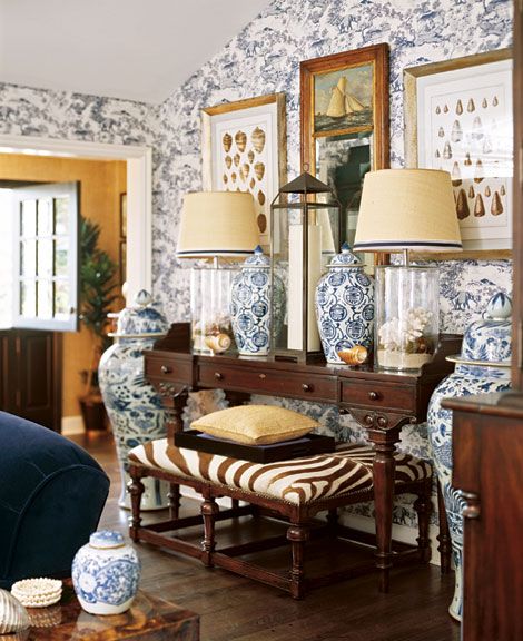
7 items and symmetrical
2 lamps, 2 ginger jars, 2 small seashells and 1 large candle holder in the centre
Bunny Wlliams bedroom
7 items - asymmetrical but looks symmetrical at first glance
2 large plants, 1 medium floral arrangement, 1 porcelain figurine, 1 jar, 1 jar top, 1 candy box
Traditonal Home
3 items - low, medium and high
Asymmetrical
Verandah House
7 items assymmetrical
1 lamp, 1group of 3 books, 1 piece of coral, 1 lidded box
2 plants and 1 open book


No comments:
Post a Comment